The problem
SB Nation had grown into a network of 320+ independent sports blogs — passionate, fan-powered, each with its own voice and identity. That independence was the point. The problem was that it had gone too far.
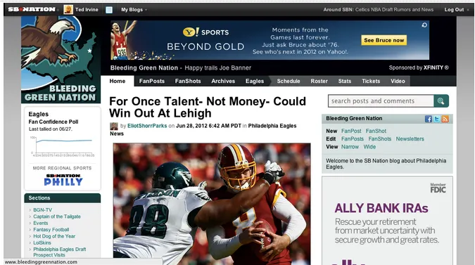
Readers would spend years on a site like Bleeding Green Nation without ever knowing it was part of SB Nation. The SBN logo sat just above each blog logo. Nobody noticed. A disjointed brand relationship, and an increasingly expensive one — every new site required a hand-crafted logo from a product designer, just to end up invisible inside its own network.
“We needed to preserve independent community character, but also present the context and power of the larger network.”
The brief
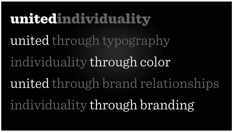
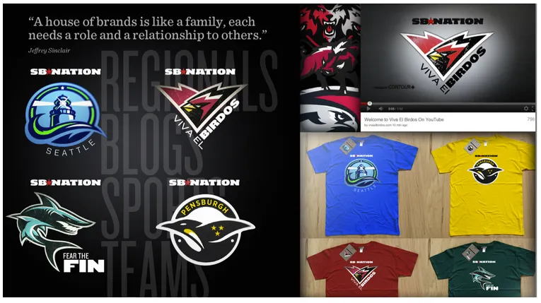
United Individuality. Two words that had to hold together without canceling each other out. The system needed to work for every sport, every team, every community — 320+ of them — without flattening the thing that made each one worth visiting in the first place.
The last time we’d redesigned the network, in 2008, we left the individual blog logos alone entirely. That was the safe choice. It cost us years of brand incoherence. We weren’t going to do that again.
Three directions
- 01 Build on current branding — Leverage the existing marks, but fully integrate the SB Nation logo. The idea was to retain the existing character while standardizing the lockup. The reality: the logos had been made by different designers over the years in completely different styles, typefaces, and proportions. Integrating them convincingly was unrealistic. Cut.
- 02 One designer, all marks — Have a single designer rebuild every logo from scratch for a consistent system with room for individual character. After seeing Fraser Davidson’s work on Dribbble, this became the clear path. The quality ceiling was immediately obvious.
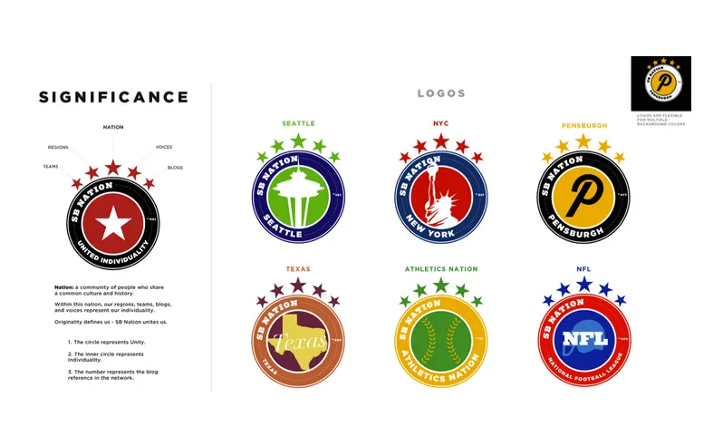
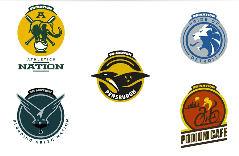
- 03 Shapes as a unifying system — Use geometric shapes to hold the family together and create visual wayfinding across sports and site types. Designer Levin Mejia explored placing the SB Nation logo on an arc in a circular format with custom inner graphics. Everyone in the room recognized it immediately. This was the one.
The system
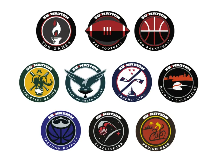
The circular format did two things at once. The outer ring belonged to SB Nation — the wordmark on an arc, standardized typography for the blog name beneath. Clear, consistent, impossible to miss. The inner circle belonged to the blog — illustration, character, culture. Whatever made that community itself.
It solved the brand relationship problem structurally. You couldn’t look at any mark and not understand both what the site was and where it lived. And because the outer ring was standardized, the inner circle could be completely free — the system got tighter while the individual identities got more expressive.
“The outer circle for SB Nation. The inner circle for everyone else. That’s the whole system.”
The execution
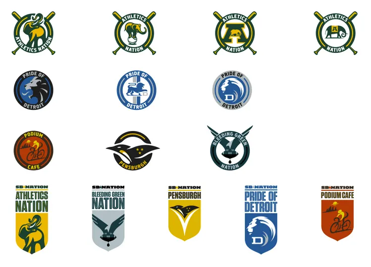
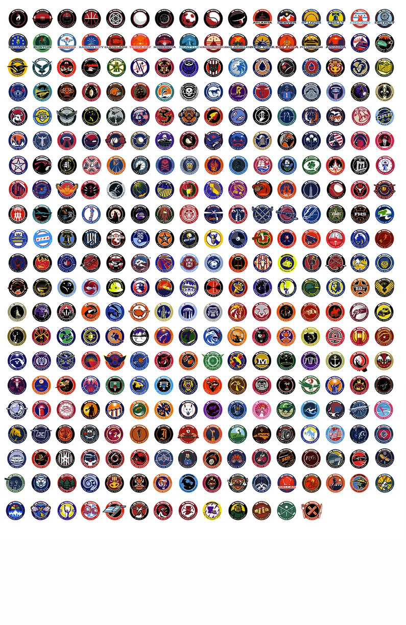
With Fraser Davidson locked in, we built a process that could scale to 330+ marks without collapsing under its own weight.
- 01 Creative brief system — Every blogger completed a questionnaire that became their creative brief. Suggested elements, cultural references, what they wanted to keep from the old mark, what they wanted to change. Meaningful input without requiring 330 separate design conversations.
- 02 Legal review built into the pipeline — SB Nation blogs identify closely with teams but aren’t official team properties. Every mark went through legal before it reached the blogger. Trademark clearance baked into the process, not bolted on at the end.
- 03 One revision round — Given the scope, we limited each blogger to a single revision. The constraint held. The overall reception was positive — the marks were good enough that most bloggers didn’t need more than one pass.
- 04 Fraser Davidson — 330+ marks in about 6 weeks. He worked fast enough that we were often scrambling to keep him supplied with creative briefs. That is not a sentence you write about most design projects.
The bigger point
The SBN United rebrand wasn’t just a logo project. It was proof that a brand system could scale to an almost absurd number of outputs without losing coherence — and without flattening the individual identities that made each community worth building in the first place.
The same principle is what makes design systems matter: a well-constructed constraint creates freedom, not limitation. The outer ring was non-negotiable. Everything inside it could be anything.
That lesson has informed every system I’ve built since.