
What I inherited
Inman had been covering real estate for decades, a genuine institution in the space. But the brand didn’t feel like one. It felt techy. The visual language was trying to look like a startup when the editorial product had real authority behind it.
Working in close partnership with the CEOs and CPO, I made the case for a full brand overhaul — not a refresh, a rebuild. At a mature company with real budget constraints, that meant no agency, no outside creative directors, no expensive brand consultants. Everything built in-house, by one person, against a brief I wrote myself.
The brief was simple: make it feel like it’s always been there.
The direction
Classic editorial authority. The design language of a trusted newsroom, sharp, confident, information-dense without becoming cluttered. The kind of publication that doesn’t need to announce itself because it already knows what it is.
Before
After
The key decisions
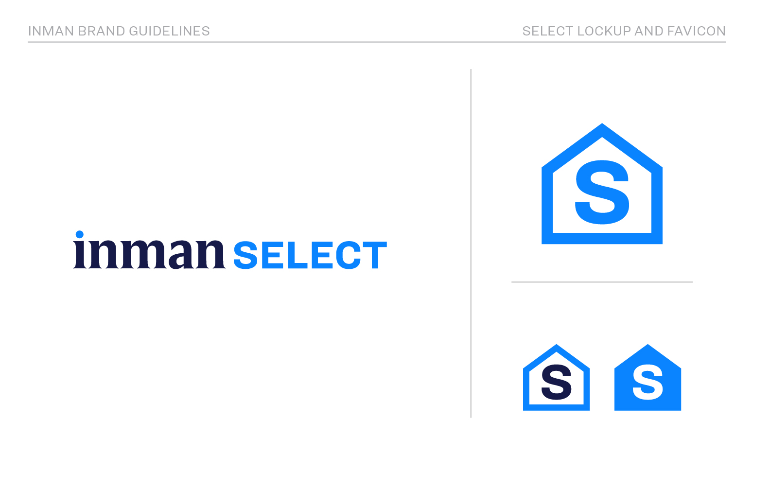
- 01 Deep navy as the anchor — Inman Dark (#161a48) became the institutional foundation. Every header, footer, and dark surface runs through it. It conveys permanence. It says this publication has been here and will keep being here.
- 02 Three fonts with distinct roles — HEX Franklin Variable as the workhorse: geometric, authoritative, legible at every size from 11px metadata to 42px headlines. Harriet Display for the literary moments, editorial features, pull quotes, where the brand needs to feel more like a magazine than a feed. Tungsten for events and promotions where you need maximum punch.
- 03 Sharp edges everywhere — Zero border radius on cards, inputs, and containers. This was a deliberate rejection of the rounded, friendly UI language of tech. Sharp edges feel like a newspaper. That was the point.
- 04 Red as editorial exclamation — Inman Red (#da3832) used sparingly: breaking news, primary CTAs, urgent alerts. When red appears, it means something. Overuse would kill that.
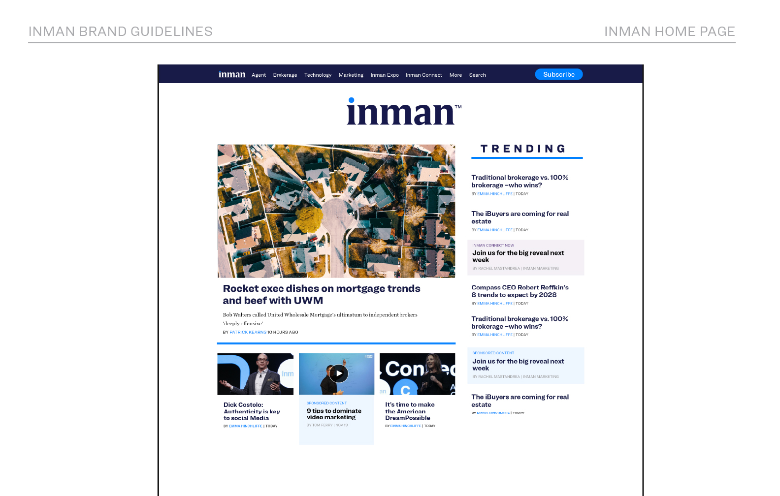
- 05 Information density without clutter — The grid and spacing system was designed for scanning, not reading. Real estate professionals read Inman on deadline. The layout needed to reward fast eyes while still holding up for long-form.
“The old brand felt like it was trying to look new. The new brand is trying to feel permanent.”
What it unified
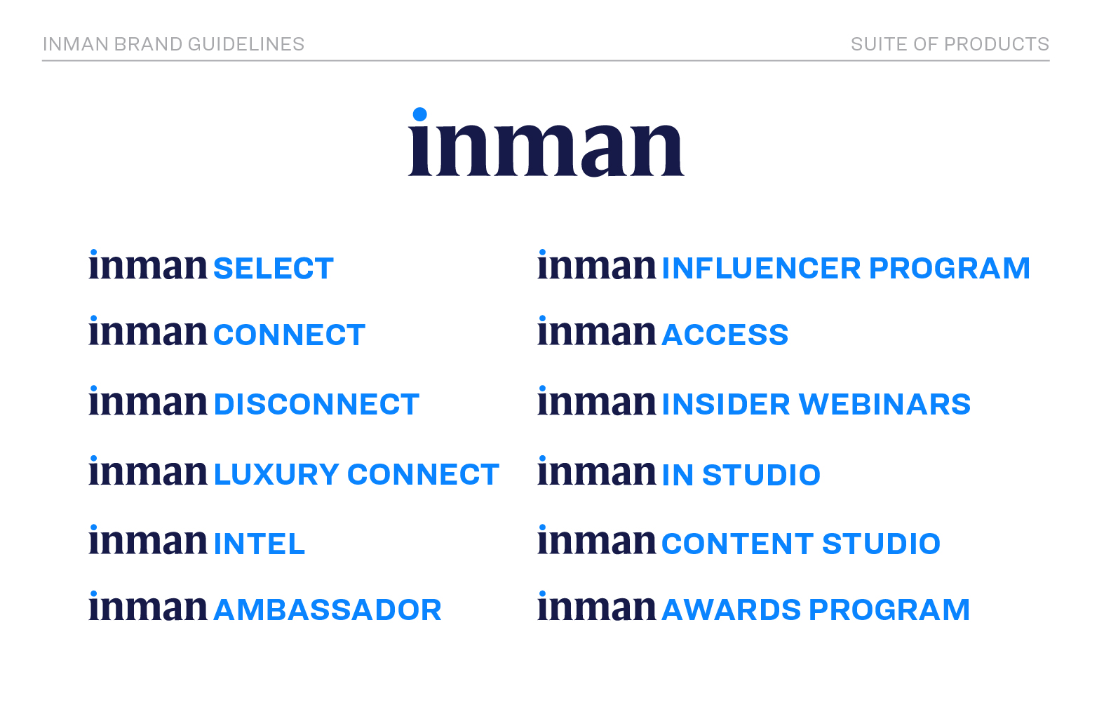
Inman isn’t one product — it’s seven. The brand system had to work across every part of the company simultaneously, each with different audiences, formats, and production constraints.
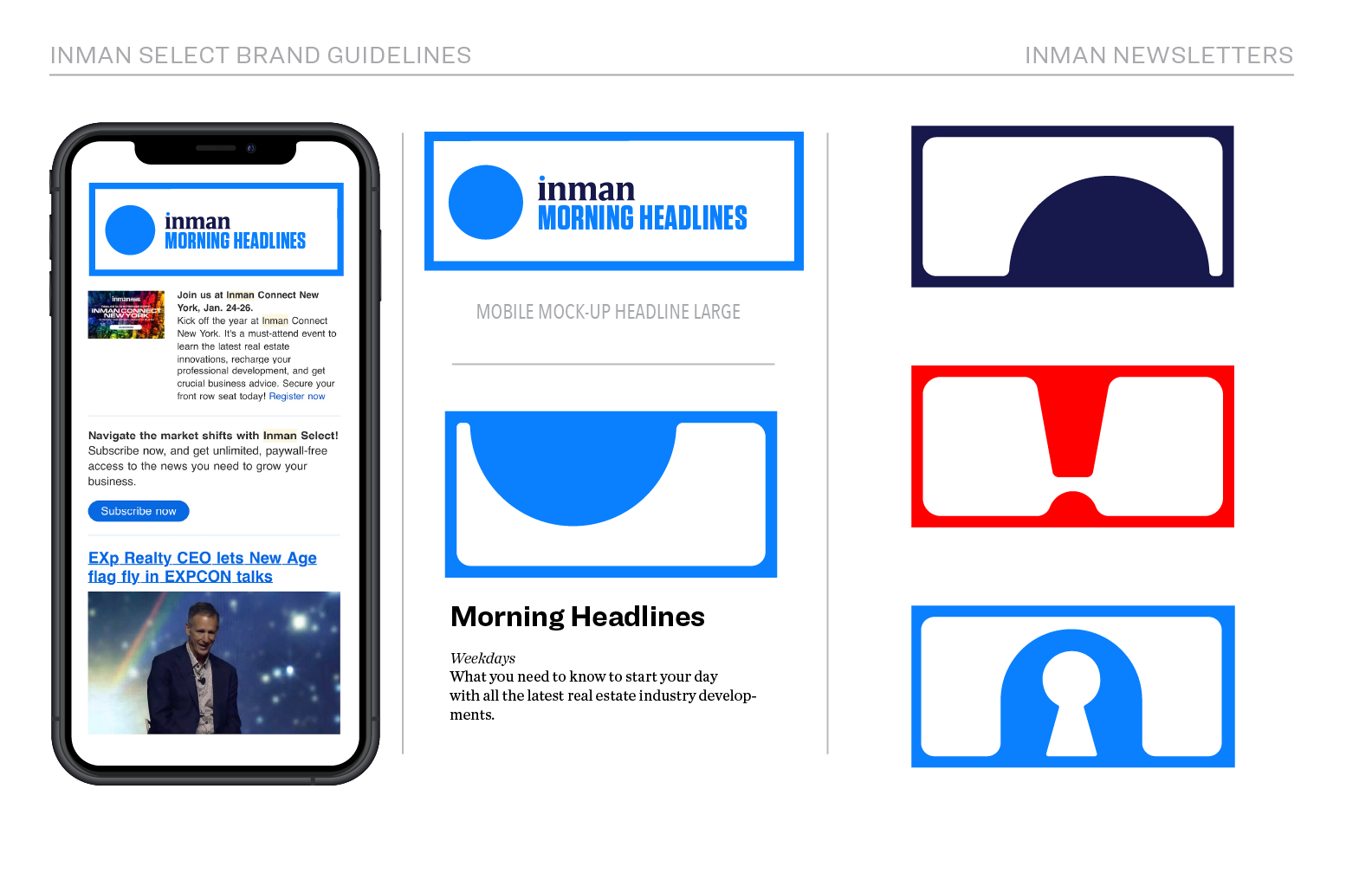
- 01 Editorial — Daily news, analysis, and long-form features. The workhorse surface. HEX Franklin at every size, sharp grid, information density that rewards fast readers without punishing slow ones.
- 02 Events — Inman Connect, the flagship conference series. Room environments, stage graphics, badge systems, LED walls. The brand at full volume — Tungsten in 200px, color blocking at room scale.
- 03 Education — Courses, certifications, and professional development. A quieter register of the brand — Harriet Display for warmth, structured layouts that signal credibility without going dry.
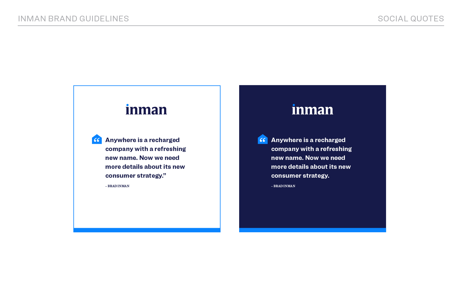
- 04 Social — High-frequency publishing across platforms with wildly different format constraints. Templated in the brand system so anyone on the team could produce on-brand content without a designer in the loop.
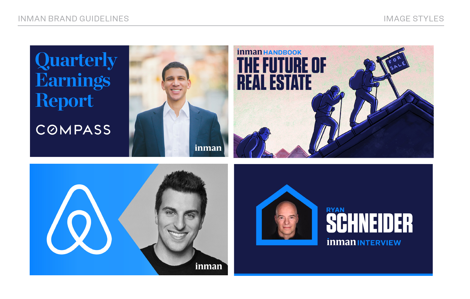
- 05 Data — Research reports, market indices, and data visualizations. The brand in analytical mode — structured, precise, authoritative. The same color system doing completely different work.
- 06 Video — Lower thirds, motion graphics, and branded video templates. The identity in motion — type and color rules that translate from static to kinetic without losing coherence.
- 07 Awards — Inman’s industry recognition programs. Ceremony materials, trophies, digital assets. The brand at its most formal — institutional, celebratory, permanent.
“One system. Seven product lines. Zero agencies. Solo.”
Chapter two — AI enters
The brand refresh was done solo. No AI assist, just design decisions made over time, tested against the editorial product, refined until the system felt right.
Then three months ago, AI changed how that brand gets used. The creative brief process, the brand standards site, the production workflow, all of that came after the brand existed. The system I’d built by hand became the thing AI needed to work within.
The infrastructure layer
The brand standards site built via Claude Code is the living documentation of everything in this case study, color values, typography rules, component patterns, usage guidelines. It’s not a PDF that gets outdated. It’s a site that people and agents can reference directly.
Alongside the site lives design.md — a machine-readable file that teaches Claude the entire Inman brand system. Not just hex values, but judgment calls: what’s universal vs. rare, what combinations are approved, how components behave in context. When AI generates anything for Inman now, it works within documented constraints rather than guessing. The brand I built by hand became the ruleset AI works within.
That’s what makes the brand scalable now. Not more headcount. Not more rounds of review. A well-documented system that AI can work within.
The full infrastructure story is in case 01.