The operation
Six events a year. Six new design systems. Two flagships — Inman Connect New York and Inman Connect San Diego. One luxury conference. Three On Tour events — Miami, Nashville, Texas. Each one gets its own visual identity, badge system, stage graphics, wayfinding, social campaign, and environmental design. No two the same. No agency. One designer.
That’s not event design. That’s a design operation running on infrastructure, judgment, and the AI workflow built to make it possible.
“Six design systems a year. The only way that works is if you’ve built the infrastructure to support it.”
Chapter 01 — Inman Connect New York
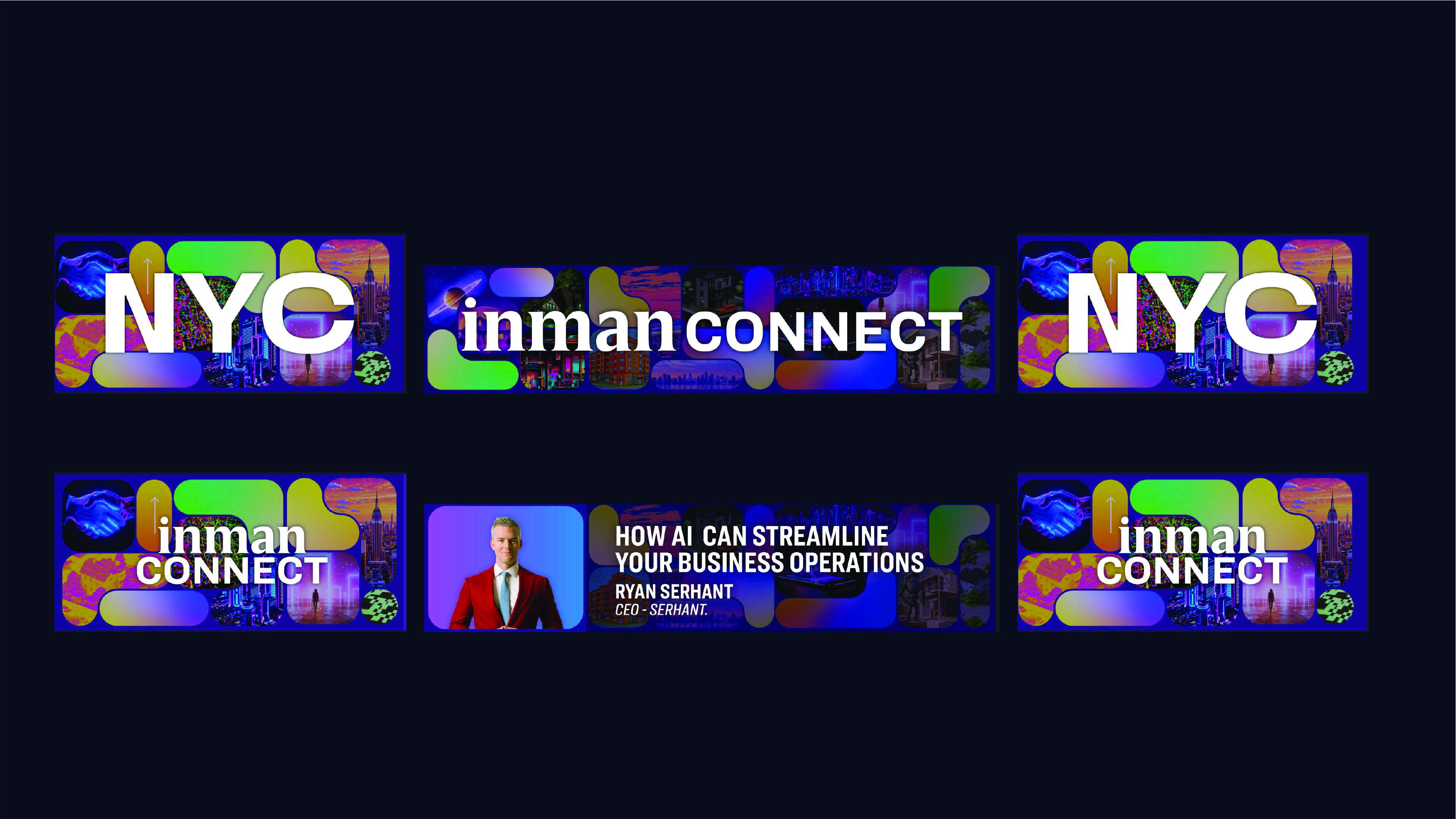
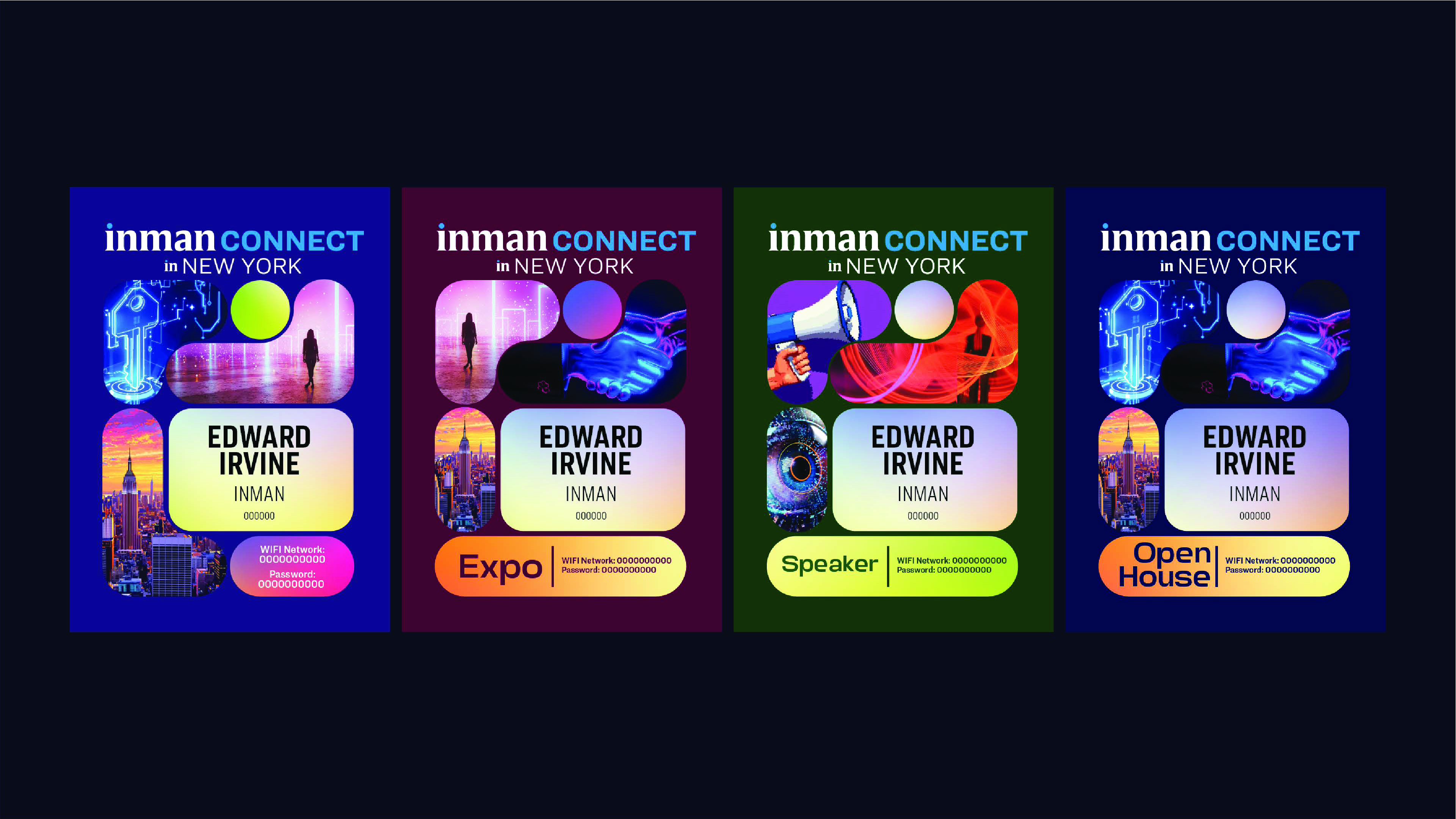
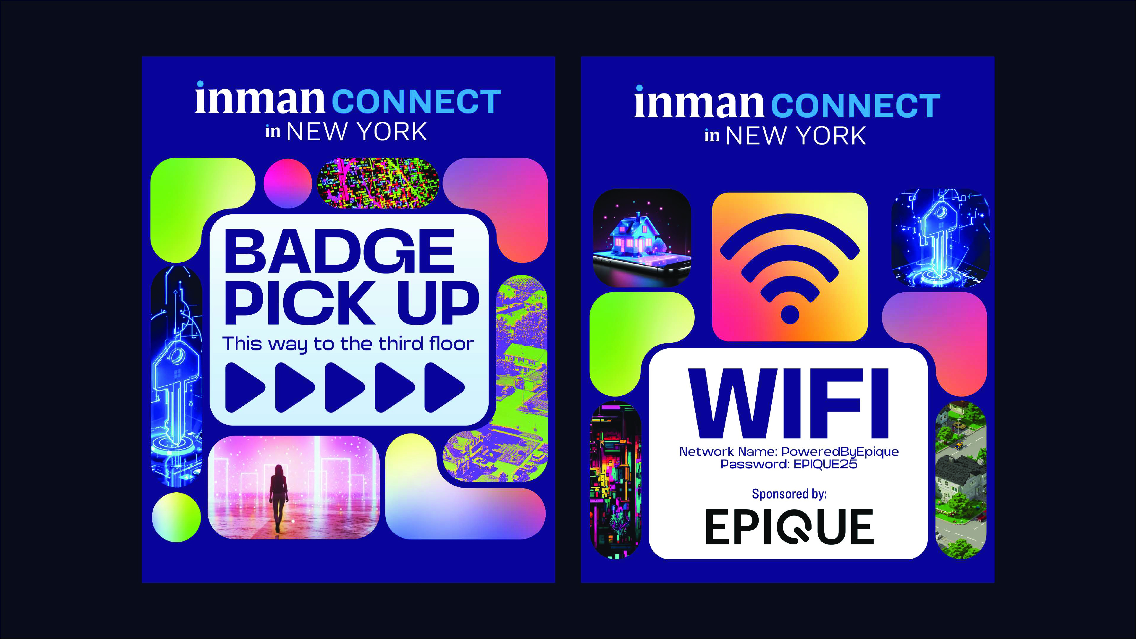
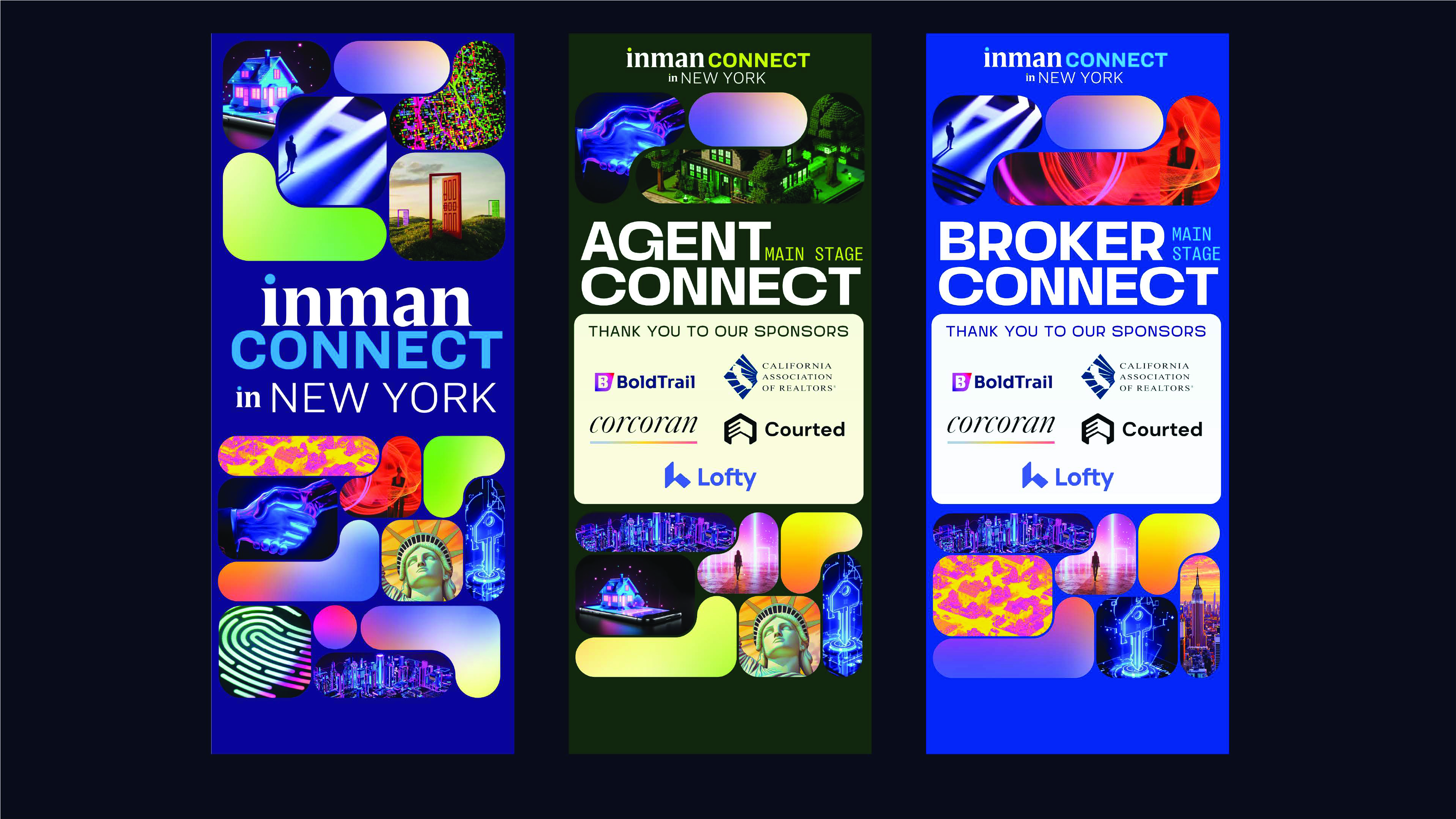
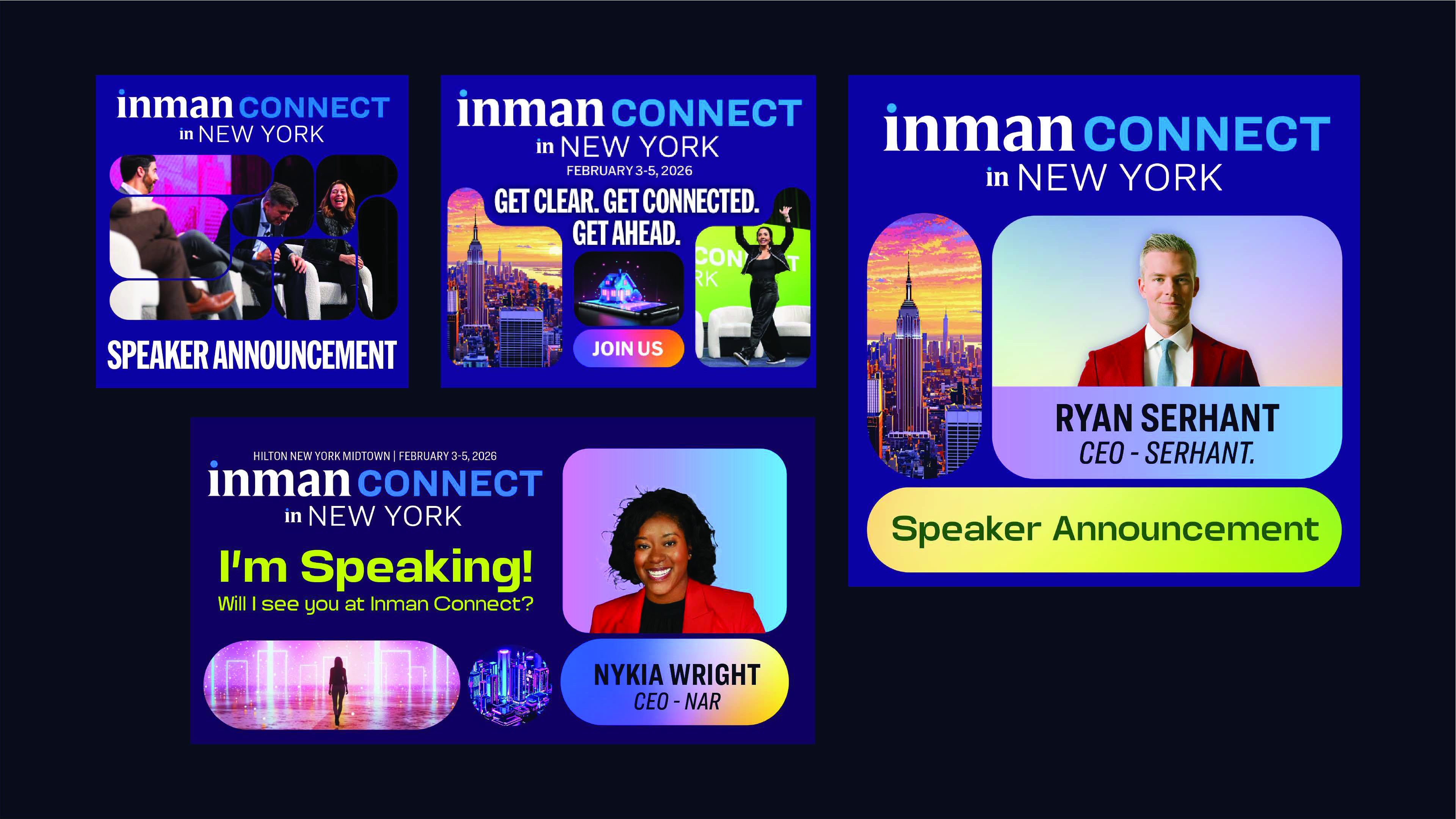
Inman Connect New York is the flagship. 3,000 real estate professionals, two stages, a full expo floor, multiple sponsor environments. Everything branded end to end — from the badge in your hand to the LED wall behind the keynote speaker.
For ICNY 2026, the design question wasn’t just how to brand a conference. It was how to use the AI infrastructure built over the previous months to produce a full environmental design system at conference scale — faster and at higher quality than before.
The AI design system
The visual language for ICNY 2026 was built on AI-generated imagery from the ground up. Each image was generated in Visual Electric — abstract, iridescent, future-forward — then composited into an organic blob-shaped container system that became the signature graphic device of the event.
The same images that appeared on badges were adapted for stage banners, wayfinding panels, social graphics, and LED wall loops. The loops were generated separately via Midjourney, taking the still imagery into motion — ambient visual environments running behind speakers on both stages.
The system was designed to flex across every format without losing coherence. A badge, a 10-foot banner, and a full-stage LED backdrop all running the same visual logic.
Chapter 02 — Inman on Tour Nashville
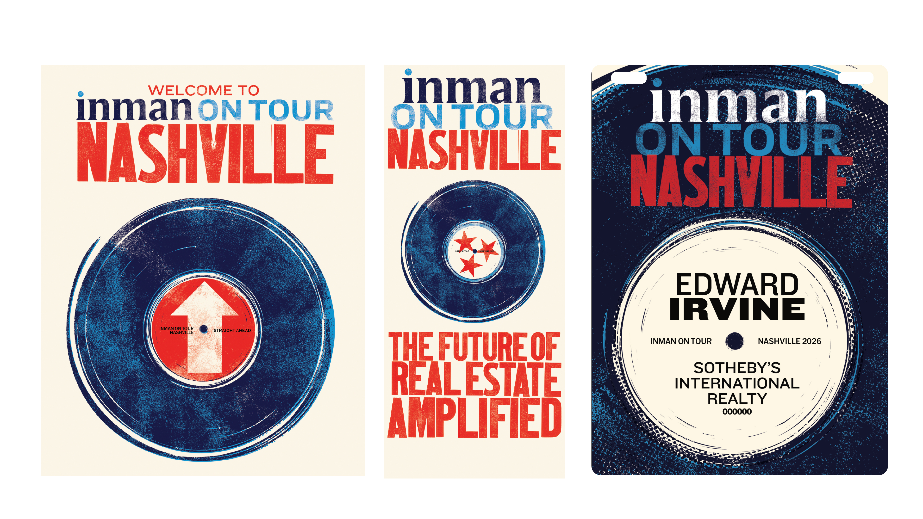
Nashville is a different event entirely. 500 attendees, one stage, an intimate format designed for a different kind of engagement. Inman on Tour is the road show — same editorial authority, smaller room, tighter community.
The brief was “Real Estate Amplified.” Nashville as a creative lens, not just a location. Music city. Volume. Energy. The design didn’t just reference Nashville — it committed to it.
The craft approach
No AI imagery for Nashville. This one was built on pure design craft — a deliberate choice to show that the tools serve the brief, not the other way around.
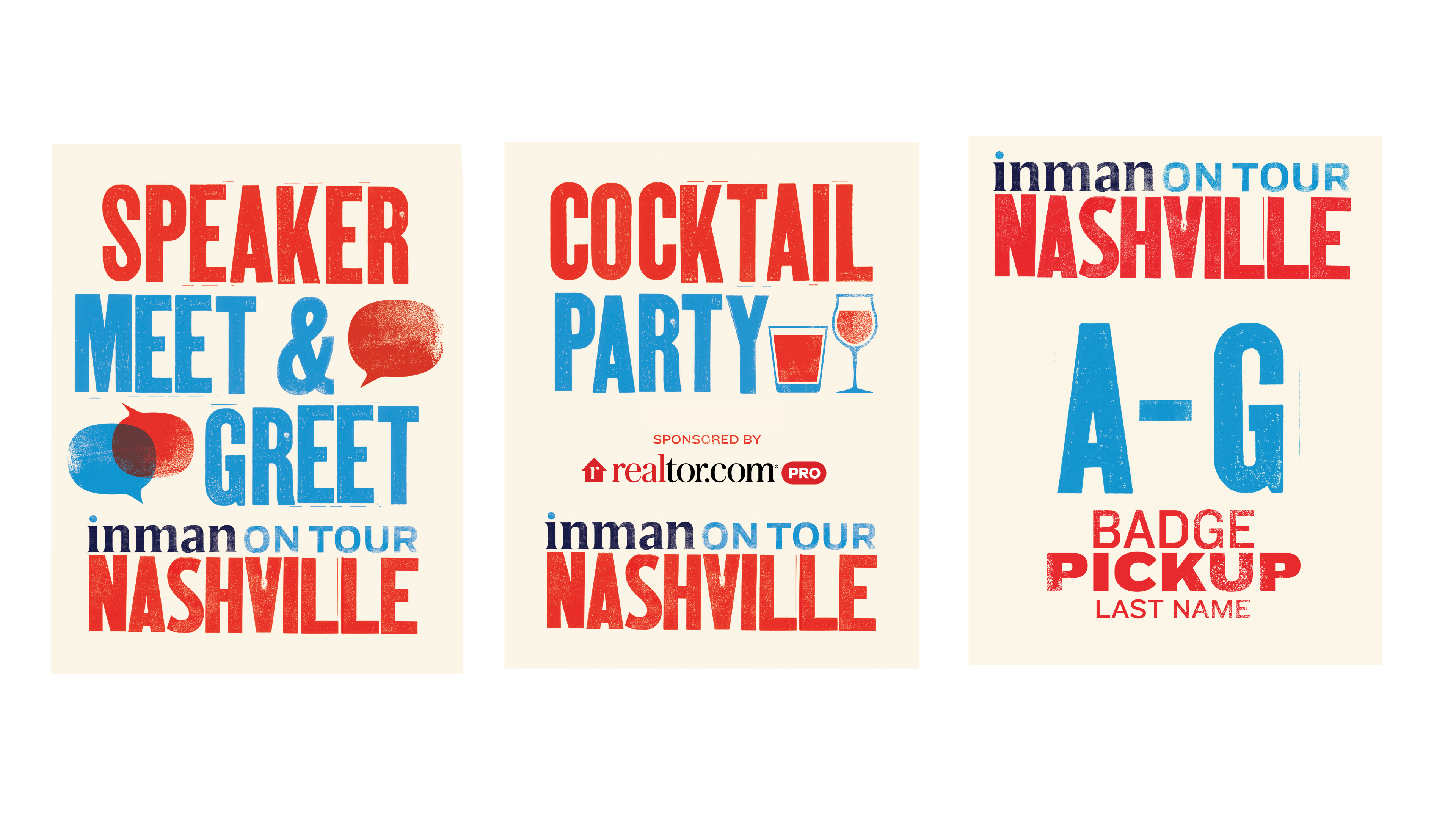
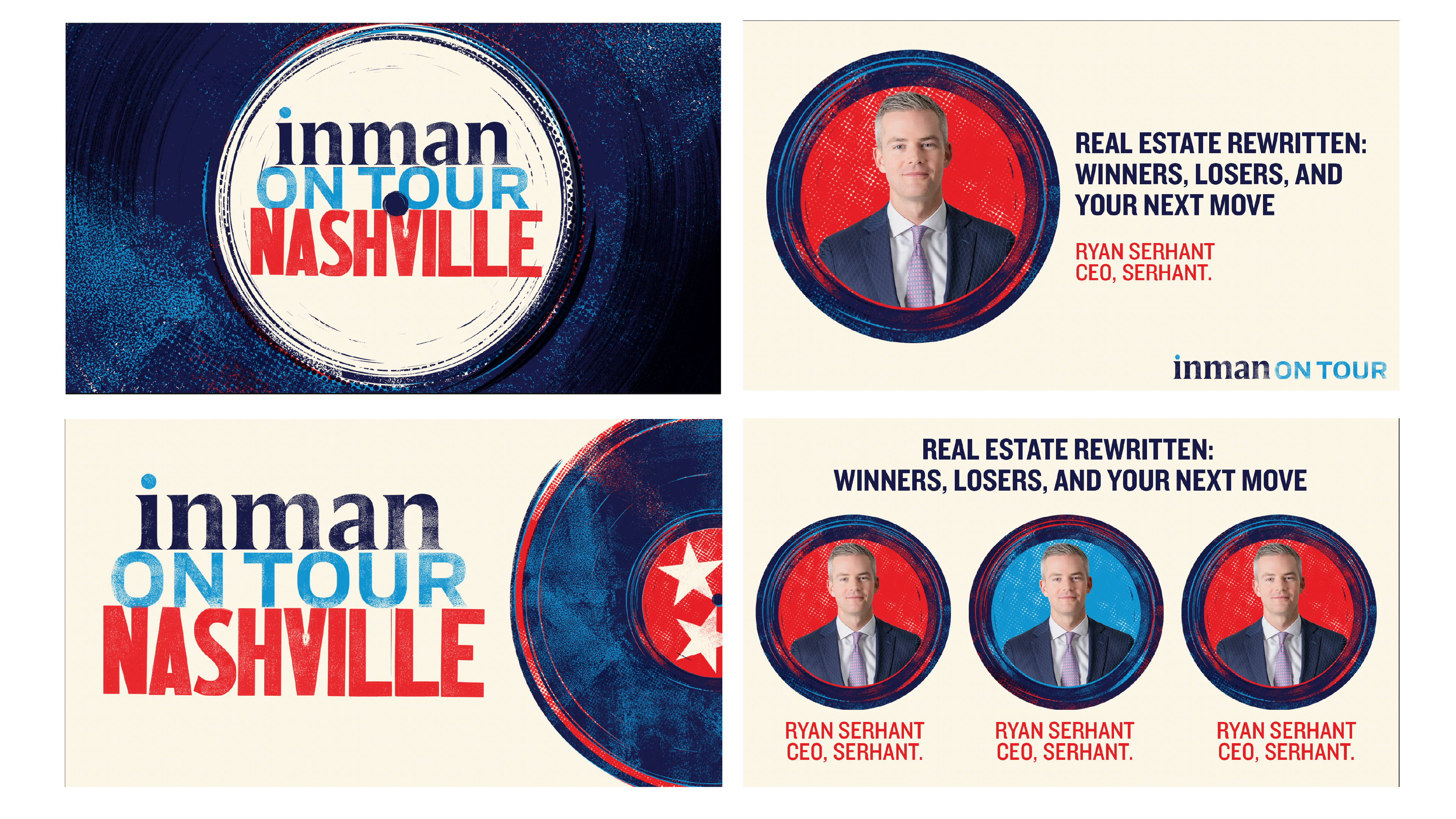
The aesthetic is gig poster. Distressed textures, Tungsten at full volume, red/white/navy pulled from the Tennessee state flag. A vinyl record as the central motif — the three-star state seal pressed into the label, the Inman wordmark riding the groove. Screen-print quality, handmade feel, the kind of event identity that makes attendees want to keep the badge.
The system carries across every touchpoint — identity, signage, wayfinding, social, speaker announcements — with the same unwavering commitment to the concept. When the design language is this specific, the whole event feels intentional.
“The tools change. The brief is still the brief. Nashville didn’t need AI — it needed a gig poster.”
The bigger point
Two events. Two completely different design languages. One brand system flexible enough to hold both.
ICNY proves the AI infrastructure works at conference scale — the same workflow built for editorial and social translates to physical environments without breaking down. Nashville proves the craft foundation is still there when the brief calls for it.
A design system isn’t good because it looks consistent. It’s good because it’s adaptable — able to be completely different things for completely different contexts while still feeling unmistakably like the same organization.